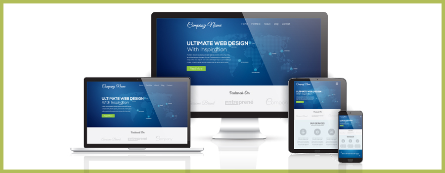
One of the newest and hottest topics in web design is responsive design and adaptive design—two similar solutions to the same problem. The problem (or more accurately, the opportunity) is that more and more web surfers are using mobile devices to access the internet. The inconsistent sizes of these devices pose a unique challenge for any website development process.
It’s also important to mention that there’s a continuing discussion in the world of web design and web development regarding what these concepts should be called and why. We won’t play the semantics game with this post, and will instead attempt to describe the concepts in a simple and uncomplicated manner.
Responsive Design
A responsive web design is a term that describes a website that dynamically resizes to fit the width of the device or browser that it’s displayed in. If you were to resize your browser with a responsive design loaded you would see the site fluidly respond to the new dimensions. A responsive web design is a great way to take full advantage of the space made available to you.
Adaptive Design
Adaptive design means a website changes its layout based on specific thresholds. A web design created in this manner uses media queries to load specific styles that react to the width of the device or browser the site is being viewed in. This is a great way to configure your site for the most popular devices, such as a large desktop browser, a small desktop browser, iPads or tablets, and smartphones.
Pitfalls and Caution
A responsive or adaptive web design is a great way to showcase a site and prepare it for the near unlimited amount of viewing variations that exist. It looks flashy and is fun to interact with. However, there are potential downfalls. Namely, you should give long thought to whether you want to feed your entire site to mobile users. Mobile users are on the go and usually have a specific task at hand (i.e. find a menu, get directions) and if you provide your full website, not only is your user experience bogged down with potentially unnecessary options, you are also forcing them to download any large images and files associated with your site that may be completely useless at a mobile size. It is worth mentioning that there are many additional technologies that can be combined with responsive and adaptive web design to alleviate some of the pitfalls mentioned above.
The use of hand held devices is only going to increase. If you are investing in a new site, it is well worth it to explore how one of these designs can make your website more accessible. Whether you go with an adaptive web design or a responsive web design, the true bottom line is that there really is no “blanket” solution. Every site should be provided a unique solution based on its own individual goals, requirements, and audiences.