Taking all of your company’s products, services, and important information and condensing them into a streamlined sitemap can be a real challenge for a lot of companies. We have had clients create sitemaps with 8, 9 or 10 main navigation points! Of course, we take the time to explain the disadvantages of having such cluttered navigation and work with them to streamline their sitemap into one that is more usable.
Having a usable navigation structure means it is intuitive, functional, and mobile-friendly. While 8 main navigation points may look just fine on a desktop, things don’t work as smoothly on a smartphone. There are best practices that you need to adhere to when creating your navigation structure for responsive design. So, when you start creating your sitemap, keep these 3 things in mind.
Keep Your Main Navigation Simple

Generally speaking, too many navigation points can confuse the end user and clutter your design. And when it comes to responsive, the problem is amplified. There is limited real estate on a mobile device, meaning even less room for main navigation. Even though your main navigation can be collapsed into a hidden menu (what we call ‘the bacon’) you still don’t want to overcrowd it. Clicking on the bacon and being greeted with a list of 10 options will fill a smartphone screen, deterring the end user. Instead, try to keep everything in 3-5 main navigation points. With 3 you wouldn’t even need to create that collapsible menu.
Make All Main Navigation Clickable
Your main navigation is there to categorize the rest of the pages on your website and summarize that category. Some people prefer not to have the main navigation clickable because they find that the content will be repetitive. We highly recommend that all navigation points (main and otherwise) are clickable for several key reasons. First off, it helps with search engine optimization (SEO). This gives you the opportunity to add more content to your website and get found for keywords. Second, users expect to click on main navigation and so removing that capability can be confusing. Additionally, you can use that page to summarize what a user can find in the secondary navigation, making your overall sitemap more understandable.
Finally, this just doesn’t work in responsive design. When main navigation points are not clickable, they rely on the hover capability for users to see secondary navigation. Unfortunately, the hover capability is not possible in responsive design.
Hide Third-Level Navigation from Drop-Down Menu
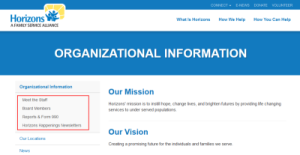
With long scrolling pages and jump links, third-level navigation is slowing disappearing from many websites. However, we understand that it is still desired by some who have deeper sites and a lot of information to share. Our biggest recommendation here is to hide the third-level navigation from the main navigation bar. Again, smartphones have limited real estate and breaking navigation down into three levels can be overwhelming and confusing for users. Instead, only show first and second level navigation in your main navigation bar and display third-level in a left side bar on your secondary pages.

As you move forward with your new sitemap for your website redesign keep these best practices in mind. After all, more and more people are accessing the web from their mobile devices and you want to give them the best viewing experience possible! If you need assistance with creating your site structure or redesigning your new website, contact Informatics today.
