What will it look like when someone makes “first contact?” We’re not on another science fiction rant (this time)—no, we’re talking about your corporate homepage.
This is the place where prospective customers and partners are most likely to make their first contact with your business, so your homepage needs to be well-crafted, welcoming, and completely aligned with your brand. For small to medium-sized businesses, the right design can significantly impact lead generation, as well as overall brand perception.
Corporate Homepage Design Fundamentals
We’ll get to the latest web design trends in a minute, but first, the fundamentals. These are the “table stakes” for online companies—the bare minimum for successful entry. Without these fundamentals, it will be hard for your business to earn customers’ trust and convince them to convert.
Clear Site Navigation
Visitors should be able to quickly find the information they need without confusion or more than a handful of clicks. A well-organized menu can take on a few different looks, but the core principle is that it guides users effectively through your story and sales funnel.
Compelling Headline and Value Proposition
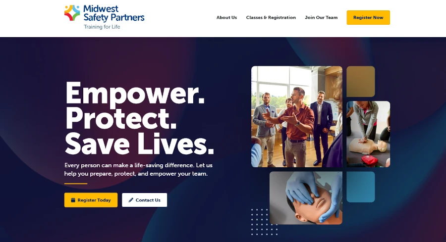
Your homepage should immediately communicate your line of work and the value you offer, right above the fold. A strong headline paired with a concise value proposition will capture visitors' attention and encourage them to explore further, like we did with the website for Midwest Safety Partners, a provider of CPR and first aid training:
Prominent Calls-to-Action (CTAs)
Your corporate homepage design should include clear and strategically placed calls-to-action. These CTAs guide visitors toward your desired conversion event, such as "Learn More," "Contact Us," "Request a Demo," or "Download Whitepaper." According to Small Biz Trends, 70% of small business websites lack a call-to-action (CTA) on the homepage—this is perhaps some of the lowest hanging fruit for any business trying to improve their lead gen!
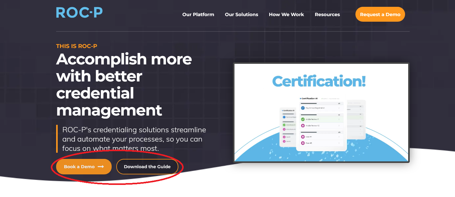
On our website for ROC-P, a SaaS platform for credentialing and certification management, we include both prominent buttons at top of every page, keeping the conversions of "Book a Demo" and "Download the Guide" (a free whitepaper) at the top of mind for every visitor. There are also conversion points positioned at the middle and end of the webpage, so we have multiple opportunities to add them to our sales funnel.
Contact Information
Make it easy for potential clients to get in touch. Prominently display your contact information in multiple places—in body copy and in your footer, for example. Bonus SEO points if your contact information is all consistent in structure and format.
Social Links
Web surfers have been trained to look in either the header or the footer of your webpage for links to your social profiles, so make sure yours are there, too. Make sure the icons are current (no outdated platforms like Google+), visually consistent with your brand style, and linked to the correct accounts. You might also consider embedding them with tracking parameters so you can measure engagement and click-through rates in your analytics platform.
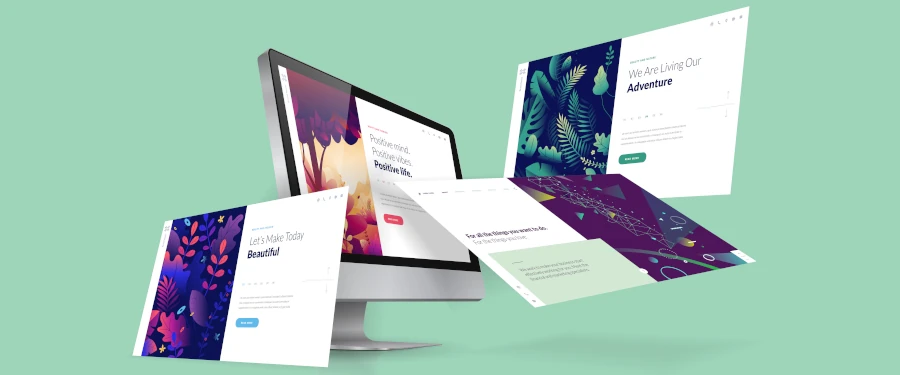
High-Quality Visuals
Incorporate relevant (preferably professional) images and videos that align with your brand identity. We know images, video, and color are the key visual elements that draw someone into a site; consistency here also builds recognition and trust.
Corporate Homepage Design Trends for 2025
Web design today requires the interplay of many skills, including graphic design, user experience design, content marketing, SEO, and more. These are the directions today’s experts are focusing on, and you should too for a modern website.
Dark Themes
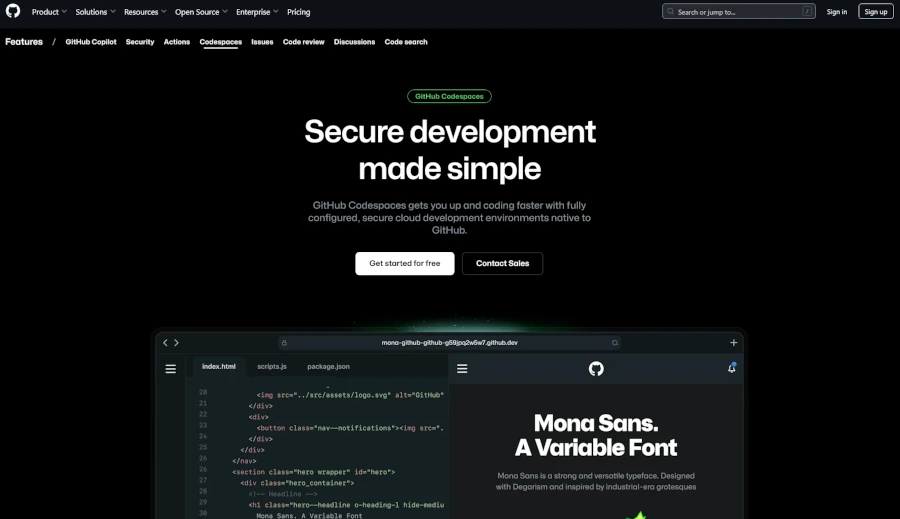
An increasing number of websites are adopting dark themes, a trend that's gaining traction across platforms (think Spotify's app). Dark themes can make reading easier, reduce eye strain, and address accessibility issues; they also convey a modern, tech-savvy aesthetic that resonates with digital-native audiences today.
Check out GitHub’s Codespaces hub, which is designed to appeal specifically to coders, developers, and other technical types who spend extended periods staring at screens. For brands that want to project innovation and sophistication, a well-executed dark theme can help differentiate their design while enhancing usability. However, it’s important to strike the right balance with contrast and color hierarchy to maintain readability and ensure important content remains easily scannable.
Bold and Experimental Typography
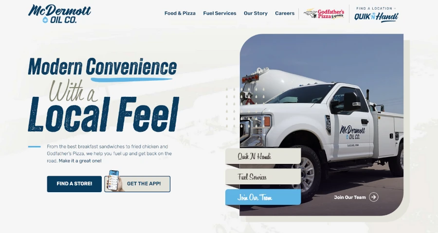
Gone are the gridded layouts and same fonts over and over again: Top web designers are using oversized typography and bold fonts to create visual interest and emphasize key messages. Sometimes, the typography is so creative, it serves as both a main image and as the message.
Above, The Variable uses a highly readable sans serif font, but sets it off with color, capitalization conventions, and other simple tricks to highlight the most necessary information for visitors.
From our own design shop, you can see this tactic at work at the top of McDermott Oil’s new website (along with our double CTA buttons!):
Micro-Interactions
Designers are incorporating subtle animations and interactive elements that respond to user actions, enhancing engagement and providing feedback. Examples include button hover effects or subtle scrolling animations.
Simplified Layouts and Minimalist Aesthetics
Always focus on delivering essential information without overwhelming users. Use clean, open space strategically to improve navigation and direct attention to core messages. 85% of web designers surveyed said crowded web design is the most common mistake made by small businesses (and we agree!). Content-oriented layouts with a clear information hierarchy can help users grasp key messages quickly; they can also help large language models and other AI bots better understand your content.
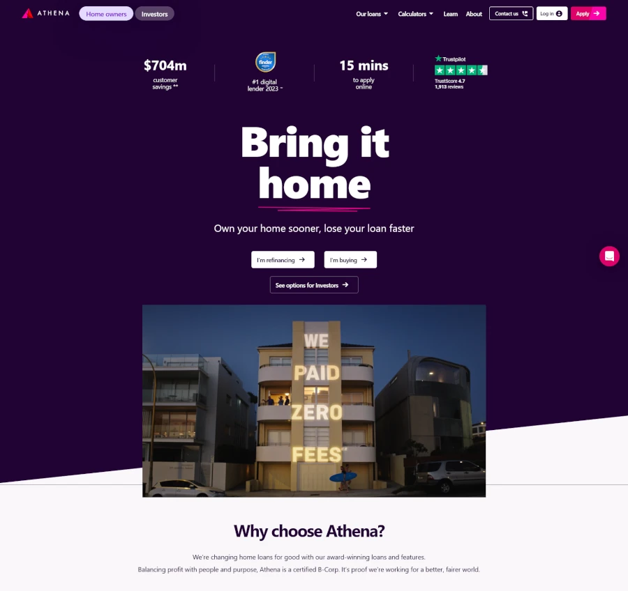
This webpage from Australian home loan company Athena is a great example of using strategic design to guide users along their journey. Look at how they structure and design their content to literally guide and push your eyes down the page.
Skeuomorphism
The newest trend is… nostalgia? Some web designers are throwing it back to the earliest days of the internet with a focus on imagery and icons that resemble their functions—think of the Windows recycle bin that populates with “trashed” files. Nostalgic design can create an emotional hook for visitors, as long as it's backed by modern tech principles, like fast loading times.
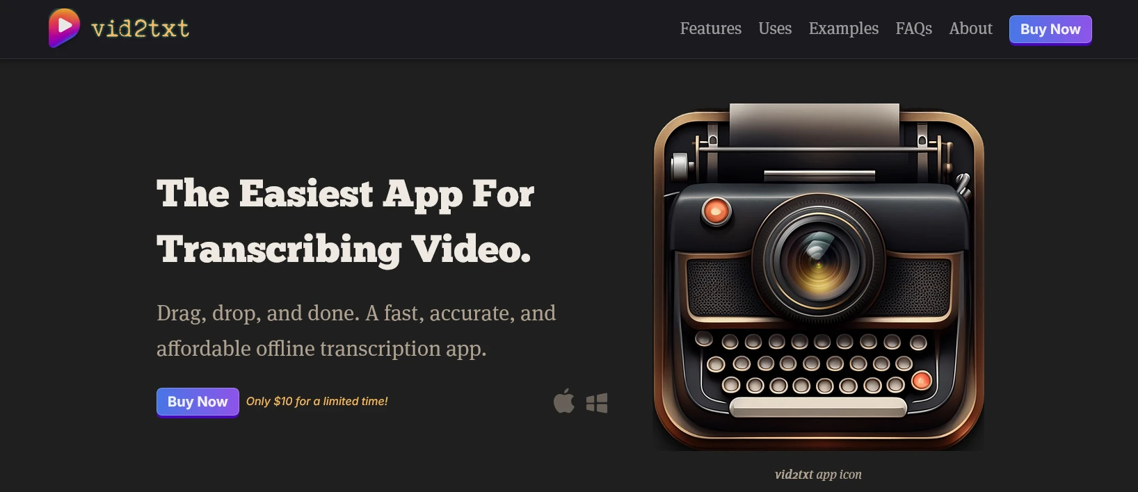
Vid2text uses a nostalgic font for its header menu, and then the product image provides a great example of skeuomorphism, an icon that successfully mashes up video and a typewriter.
Storytelling through Design
The best web designers are leveraging design elements to guide users through a narrative journey that aligns with your goals and their needs. While much of web design is about optimizing for commerce and business, this is your chance to keep some of the art in the process too.
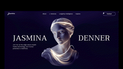
The personal website for scientist, author, and entrepreneur Jasmina Denner uses the image of a pearl on a string to literally pull the viewer through the story.
What metaphor or visual could your next design include to tie every stage of the user journey together?
Corporate Homepage Design Don’ts
Steering clear of outdated design trends is just as important as embracing new ones. Avoid these outdated elements that can make your website look unprofessional and deter visitors:
- Busy Backgrounds: Avoid cluttered or distracting background images or patterns. They can make it difficult for users to focus on your content.
- Autoplaying Music or Videos: Unless it’s a specific and intentional part of the user experience (e.g., a musician’s website), avoid automatically playing audio or video upon landing on the homepage, as this can be disruptive and annoying for visitors.
- Overuse of Stock Photos: Generic is out. Authentic is in. While stock photos can be convenient, try to use high-quality, authentic imagery that resonates with your brand, or consider custom illustrations.
- Poor Readability: Avoid small font sizes, low contrast between text and background, and overly decorative fonts that hinder readability. Two-thirds of people would rather read something beautifully designed than something plain, according to Adobe, but readability is paramount.
- Cluttered Layouts: As mentioned earlier, a clean and simplified layout improves user experience. It might be time to Marie Kondo your homepage.
The future of business demands a well-designed corporate homepage. Focus on fundamental elements like clear navigation and strong calls-to-action, while thoughtfully incorporating modern design trends and avoiding dated approaches. With this in mind, you can create a homepage that not only looks visually appealing but also effectively engages visitors and drives business growth.
And if you’re looking for help marrying the worlds of development, graphic design, and user experience into a truly modern website, contact the design team here at Informatics. Our full-service agency stays up-to-date for you, and then we make it happen!
Is your website ready for a facelift?
Our designers and strategists can develop a look that suits your brand better.